Pseudo Classes and Elements

CSS pseudo classes and elements can be used to target specific parts of the element(s) on specific state and / or add decoration to specific part(s) of your elements. These can be used to for example to define how your links or buttons looks like when mouse is hovering over them.
Pseudo classes

CSS pseudo classes are keywords that can target special state of an element. Pseudo class selectors start with comma :. There are a lot of different kind of pseudo classes, but some of the most used of them are: :hover, :focus, :visited, :first-child, :last-child. Read more about pseudo classes.
Example 1 (Makes all buttons that user is hovering over red):
Example 2 (Makes the first child element of a list bold):
Example 3 (Removes left and right padding from first and last navigation items):
Example: Styling Links on your Website with Pseudo Classes
Links on your website can be easily styled with these CSS rules:
CSS:
/* normal link */
a {
  color: red;
}

/* visited link */
a:visited {
  color: green;
}

/* mouse over link */
a:hover {
  color: hotpink;
}

/* selected link */
a:active {
  color: blue;
}
Pseudo Elements

s CSS pseudo element is a keyword added to selector to style specific part of the selected document(s). Pseudo elements are defined after double colons ::. Read more about pseudo elements.
Example (Makes first letter of every <p> element be bold):
::before and ::after
::before and ::after are quite used pseudo elements to add something before or after the element. We can use this to for example add some text before or after an element or to create a tooltip.
Example 1: Adding text before <p> element
Example 2: Adding tooltips for elements with attribute data-tooltip set
*[data-tooltip] {
  position: relative;
}

*[data-tooltip]:hover::after,
*[data-tooltip]:focus::after {
  content: attr(data-tooltip);
  position: absolute;
  left: 0px;
  top: 24px;
  min-width: 150px;
  background-color: black;
  color: white;
  border: 1px solid black;
  border-radius: 10px;
  padding: 12px;
  font-size: 14px;
  z-index: 1;
}
Exercise 1: Styling Buttons

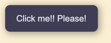
It is also super easy to give your buttons better looking style and give them better effect when hovering over them. Let's first give our buttons better looking style that looks like this:
HTML:
CSS:
.btn {
  background: #403D56;
  color: #e6e5ec;
  padding: 13px 18px;
  font-size: 14px;
  border: 0px;
  border-radius: 8px;
  box-shadow: 2px 2px 10px 2px rgba(0,0,0,.3);
  transition: 1s all ease;
}
Then let's just add hover effect for the button:
CSS:
.btn:hover {
  background: #2f2c47;
  cursor: pointer;
  box-shadow: 2px 2px 10px 5px rgba(0,0,0,.3);
}
Now we can also reuse this button anywhere on our website. Should you want to even create smaller buttons that you can use on your site, you could add additional class for this, too:
CSS: