Syntax
Syntax in Inline Styles

CSS consists of CSS rules that you apply to your HTML elements. All of your inline CSS styles are applied inside the style attribute. Inside your CSS rules you have declarations. Each declaration has a property and a value separated with a colon : and each declaration is separated with semicolon ;. You can have multiple declarations for a single rule.
Example:
Syntax in Internal or External Stylesheets

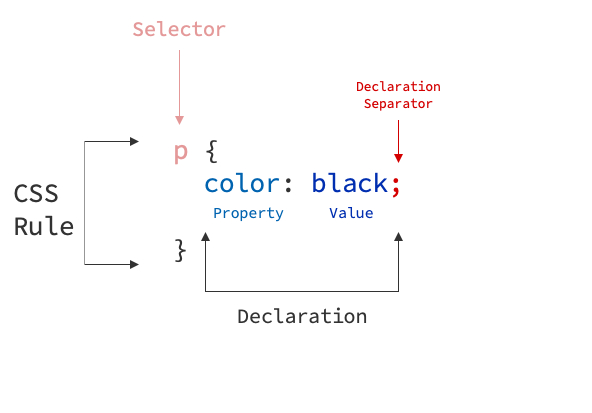
In internal or external CSS stylesheets, you define a selector (which is div in the example below) and wrap the CSS rules inside the curly brackets {}. Inside the curly bracket CSS rules you have declarations. Each declaration has a property and a value separated with a colon : and each declaration is separated with semicolon ;. There can be multiple declarations inside one CSS rule.
Example:
Adding Comments

Comments inside your CSS code can be added inside /* */. Example: /* I am a comment*/.
Previous Section Example with Comments:
div /* CSS Selector */ { /* CSS Rule Begins */
  background-color: red; /* CSS Declaration */
  border: 1px solid black; /* CSS Declaration */
} /* CSS Rule Ends */
Documenting what we do:
More About CSS Syntax
You can learn more about the CSS syntax from this article.
Often Used Basic CSS Properties

I have listed few basic CSS properties here that I use very frequently during my development. This listing of CSS color values is also very good starting point to have a look at what different color values you can add by default.
| Property | Description | Example(s) |
|---|---|---|
| text-align | Aligns text to left, center or right. | text-align: center |
| color | Changes text color of the element | color: blue | color: #ffffff |
| background-color | Changes element's background color | color: blue | color: #ffffff |
| font-size | Changes text font size | font-size: 16px | font-size: 1rem |
| text-decoration | Changes text style (none, underline, overline...) | text-decoration: none | text-decoration: underline |
| border | Sets border for the element. Syntax: size style color | border: 1px solid black | border: 3px dotted gray |
| border-radius | Sets radius for element's border. | border-radius: 4px |
| padding | Sets padding for an element (spacing before element border) | padding: 3px |
| margin | Sets margin for an element (spacing after element border) | margin: 3px |
| box-shadow | Sets shadow for an element. Syntax: x y blur spread | box-shadow: box-shadow: 0px 0px 20px 0px black | box-shadow: 0px 4px 12px 0px lightgrey; |
| display | Sets how the element is displayed (rendered) on the page | display: block | inline-block | inline | none | flex | grid |
Measurements

A lot of different CSS properties accept values with different measurement units. Read more about CSS units.
Pixels and Percentages
The oldest and most used units are pixels (px) and percentages (%). Pixels can be used to staticly set width, height of an element or for example font size. Percentages can be used to for example set the width or height of an element relatively to the parent container size.
Examples:
Viewport Width and Height
Viewport Width and Height are more newer CSS measurements. Usage of vh and vw is quite simple; they are relative to the viewport (browser) size. vh stands for Viewport Height and vw stands for viewport width. So for example to make your element to take up 50% of your browser width and 100% of your browser height, you can define these:
Rem and Em
Rem and em units are also later CSS measurements. Rem scales based on your page main font size. Main font size is by default your browser default (16px) but if you define another font-size for your html element, this will be changed. So for example if your main font size is 16px and you set font-size: 2.5rem for an element, element will have size of 16 * 2.5.
Em then on the other hand acts exactly like rem but scales based on element's parent. It will allow more fine-grained tuning of element's size.
Example:
Rem, Em, Px -- Which one to use?
Usually when creating a website and the css designer defines the page font size and element sizes the designer picks one of these measurements and uses it during the development: px, rem or em.
Using any of these measurements works. Pixels are mostly used by oldschool developers and require little bit more tuning to have better responsivity as they are hard-coded sized and the size of pixels does not change. They can still be used, but as it is 2020 it might be better switch to rem or em.
When comparing rem and em elements, rem is easier and more recommended to use as it scales just from your browser main font size. em is more trickier but allows more flexibility. I would personally recommend using rem and then em only if you need it.
Read more about the difference between px, rem and em and the confusion between these two units.