Flexbox (Flexible Box)
Flexbox (flexible box) makes it easy to create flexible responsive layout structures.
Setup
For this exercise, create file flexbox.html and paste the code below into it. Open that file with Visual Studio Code and open with Live Server.
<!DOCTYPE html>
<html lang="en">

<head>
  <meta charset="utf-8">
  <title>Flexbox</title>
  <meta name="viewport" content="width=device-width, initial-scale=1, shrink-to-fit=no">
  <style type="text/css">
    .flex-container {
      display: flex;
      background-color: orange;
      flex-direction: row;
      height: 330px;
    }

    .flex-container > div {
      background-color: black;
      color: white;
      margin: 10px;
      padding: 20px;
      font-size: 30px;
    }

    .flex-container > div > p {
      margin: 0px;
    }
  </style>
</head>

<body>
  <div class="flex-container">
    <div class="item-1"><p>1</p></div>
    <div class="item-2"><p>2</p></div>
    <div class="item-3"><p>3</p></div>
  </div>
</body>

</html>

Getting started with Flexbox - Main Container Properties
Now you should see a page with three boxes and a background color behind all the boxes. This is our starting point for flexbox. Currently our .flex-container is our main container for our flexbox contents. Inside we have just three boxes which are next to each other.
We will first start by having a look at CSS parameters we can modify on our main container and then what we can modify for our child elements.
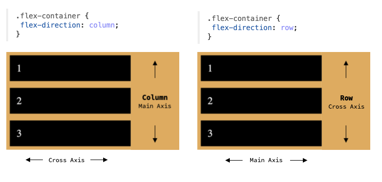
Two Axes of Flexbox
One important aspect with flexbox is to know that there are two axes in flexbox direction: main axis and cross axis. Your main axis depends on the direction your flexbox goes into: either horizontal (row) or vertical (column).
flex-direction
By default, content inside your flexbox is spread horizontally (row). But you can change this with the flex-direction CSS property that accepts values row, row-reverse, column and column-reverse. By changing this to reverse direction, it will just reverse content directions. When referring back to the two axes, this actually changes the main axis of your flexbox. Example:
Aligning your Content on the Main Axis
In order to align your child elements on the main axis, you can use the justify-content CSS property. Default value for this is flex-start.
In order to change the element(s) starting position from left, center to right you can use the flex-start, center and flex-end properties.
Then we also have three more CSS properties that we can use to modify this: space-between, space-around and space-evenly. First one adds space between all the elements, second adds space around all the element sides and last one adds space evenly between all the elements.
Aligning your Content on the Cross Axis
To align content on the cross axis, we can use the align-items CSS property. This is very similar to the justify-content CSS property above. Default value for this is stretch.
In order to position our child element(s) top, center or bottom we can use the flex-start, center and flex-end values.
Then we also have the stretch and baseline values. Property stretch stretches our child elements to take the whole height. Property baseline aligns the items so that their baselines will be aligned.
Switching Axes
Now that we have modified the alignment of our flexbox, let's try switching the flex-direction again. This will now change our axes and our justify-content and align-items properties now work on different axis. Example:
Wrapping Content
By default flexbox sets so that your content never wraps to multiple lines. To change the content wrapping CSS property, we can use flex-wrap with default value set to nowrap. We can change this value to wrap in order to wrap the content. There exists also the wrap-reverse value, but this is much less commonly used. Example:
Shorthand for Wrapping and Direction
There exists also a shorthand for defining your flex-direction and flex-wrap properties with a single CSS property: flex-flow.
Example:
Aligning Content Wrapping
What you can also do is that you can change how your flexbox aligns your content when it wraps. CSS property align-content can be used for this. Default value for this is normal. Note that this property only works when you have wrapping enabled for your flexbox.
The property align-content accepts quite a lot of different values and some of the most commonly used of them are: flex-start, center, flex-end, stretch, space-between and space-around.
Example:
Child Container Properties
Now we have covered all the basic parent container properties. Now – let's have a look at child container properties.
Ordering the Items
By default, all your flexbox items are laid out in the order that you wrote them in your HTML code. But we can change this ordering using the order property that accepts number as it's value.
Example:
Growing Items
By default your flexbox items only take the space they need on the main axis. But you can change the elements to take up all the remaining space by using the flex-grow property. Default value for all your flexbox items is 0. You can also use the flex-grow property to set some items to take up more space than others relatively.
Example 1 (All items take up all the space evenly):
Example 2 (Item 2 is 2 times bigger than other items):
Shrinking Items
You can set the property flex-shrink with given value to set how the item will shrink if there is not enough space available. By default the value for this is 1. By setting this value to 0 your element will not shrink at all. By setting this value to higher than the default 1, your element will shrink based on other child element's shrink properties.
Example (This element no longer shrinks):
Setting Default Size for Items
Property flex-basis can be used to set the default size for an element in the main axis. Default value is auto which automatically distributes the element on the axis based on it's size. Value can be set in dimensions like px, em, %.
Example:
Flex shorthand
The property flex is used to set the flex-grow, flex-shrink and flex-basis properties with one property. It is recommended to use this property instead of individually setting these properties. Default value for this is: 0 1 auto.
Example 1:
Aligning Item Individually on Cross Axis
Property align-self is the same as parent container's align-items property but it can be used to individually align an item in the cross axis. Same values can be passed for this property as for the align-items property.
Example:
Flexbox inside Flexbox
It does not stop here. We can even create flexboxes inside flexboxes to improve alignment of our content. So for example to vertically align your numbers inside the child div's we can make the child div's to be flex elements and then add the align-items: center CSS property for it. Example:
Flexbox Cheatsheet
Here you can find super good cheatsheet about flexbox and it's CSS properties.
Let's play a Game
This game is great for training some basic concepts of flexbox: https://flexboxfroggy.com/